

Welcome back for this third blog about the basics of CSS. Today, we will take a closer look at layout. If you’re using WordPress, consider our Managed WordPress Hosting for optimized performance and hassle-free management.
It’s now time to get serious with this 8th course with some sweet css layout. We will be creating a fully functional web page template. The page will have a horizontal and vertical menu, a header, footer and content.
HTML Structure
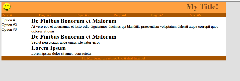
Here is the template image and the HTML code to archive this structure:

<div class="wrap">
  <div id="header">
    <img src="sourire.png" height=30 >
    <h1>My Title!</h1>
  </div>
  <div id="topmenu">
    <ul>
      <li>Page #1</li>
      <li>Page #2</li>
      <li>Page #3</li>
      <li>Page #4</li>
      <li>Page #5</li>
      <li>Page #6</li>
    </ul>
  </div>
  <div id="content">
    <h2>De Finibus Bonorum et Malorum</h2>
    <p>At vero eos et accusamus et iusto odio dignissimos ducimus qui blanditiis praesentium voluptatum deleniti atque corrupti quos dolores et quas </p>
    <h2>De Finibus Bonorum et Malorum</h2>
    <p>Sed ut perspiciatis unde omnis iste natus error p>
    <h2>Lorem Ipsum </h2>
    <p>Lorem ipsum dolor sit amet, consectetur p>
  </div>
  <div id="sidemenu">
    <ul>
      <li>Option #1</li>
      <li>Option #2</li>
      <li>Option #3</li>
    </ul>
  </div>
  <div id="footer">
    <p>HTML basic presented by: Astral Internet</p>
  </div>
</div>
Now that we have the HTML code laid down we can start working on the CSS styling. We can choose random colors, for my part, I’ve selected a random color scheme from the site: colorschemedesigner.com.
Adding the CSS
To start my CSS file, I’ll use a special selector, the “*” selector which means all element. I will want to remove the padding and margin of each element since different browser use different styles.
* {
  padding:0px;
  margin:0px;
}
Next step, I will set a background color for the entire document:
body{
  background-color:#e0e0e0;
}
If we want our web page to stay nice and center within the browser, we will need to wrap our entire HTML document into a special div that we will center in the screen.
In the header of our HTML document, we will need to specify which version of HTML we plan on using to display the page (Ex: HTML4, HTML 5 or XHTML,…). In our case, we will be using HTML5 standard tag so we will be adding this line before our tag inside our HTML document otherwise some CSS tricks won’t be working properly.
Block Wrapping
New to center our “wrap” block in the screen, we will need to specify a few thing. First, the width of our block, for this example, I will be using 900 pixel. Secondly, we need to set the space on the right and left side of the screen. Since we will never know for sure what the amount of free space on screen is, they’ve created a special term in CSS so the browser will calculate the space for us, here how we can do it:
.wrap {
  width:900px;
  margin: 0 auto;
  background-color:#ffffff;
}
In this case, I’ve also place a white background color in our wrap element.
The Header
Next step, we will set the header of our web page. For this layout, I will want to set the height of my header to 43 pixels and align the text to the right. I also want to place my logo (smiley face!) on the left side of my header using the float property. Here the code:
#header {
  background-color:#FFA040;
  color:#774b1e;
  text-align:right;
  height:43px;
}
#header img {
  float:left;
  padding:5px;
}
#header h1 {
  margin:0 30px 0 0;
}
In the above example I’ve use the margin and padding property, we will be looking at those property in our next course. You can also notice that I’ve used multiple keys in my selectors to limit my styling only to the header.
Vertical Menu
Now for the vertical menu, I will have the menu 20 pixels high, but I will need a few extra tricks in order to display my list vertically. First thing is to disabled the dot in front of each element, secondly I’ll need to display my element in a block of specific width and finally, I need them to float to the left so they’ll display one beside each other. Here is the code:
#topmenu {
  color:#FFe573;
  height:20px;
}
#topmenu ul {
  margin:none;
}
#topmenu ul li{
  list-style-type:none;
  float:left;
  display:block;
  width:150px;
  background-color:#a65400;
  color:#ff8100;
}
In the above example, I’ve change the “list-style-type” to none, this has removed the dot in front of all list elements, but you can replace the dot by other symbol, here is a site showing a list of all different kind of bullet: https://www.w3schools.com/cssref/playit.asp?filename=playcss_ul_list-style-type&preval=disc.
Hover Effect
Just to add a little wow effect, we will be adding a hover effect on our menu to create a button like effect, and we will do it in CSS!
#topmenu ul li:hover{
  background-color:#ff8100;
  color:#774b1e;
}
This will advise the browser to change color every time the mouse hovers above one of the menu element.
Now back to the basic from our previous tutorial and let’s create two columns to display our side menu and our content windows.
#sidemenu {
  float:left;
  width:100px;
}
#content {
  float:right;
  width:780px;
}
Now to finish our webpage, we just need to add our footer like so:+
#footer {
  color:#FFe573;
  clear:both;
  color:#ff8100;
}
If you’ve used the same color as I did, you should get a result similar to this one:
In our next course, we will take a look on margin and padding. Meanwhile, I invite you to take a look at our video tutorial for additional information.
Here is the video version our this course:
Leave a Reply